Air India’s rebranding – COLOSSAL MISSED OPPORTUNITY
particularly coming from a conglomerate renowned for some great identity systems for brands like Tanishq and Docomo.
The need for this overhaul was primarily because of a change in ownership and the imperative task of managing the airline’s negative image. Air India over the years developed a bad rep among the audience, hence once it was acquired by TATA, the natural progression dictated a relaunch with a fresh perspective.
As articulated in their official Source – “Inspired by our heritage but looking to the future, this new brand identity embodies the spirit of India and Air India while symbolising the limitless potential of what lies ahead. Every aspect is rich with meaning and has been crafted to reflect the vision for the brand – one that is bold, progressive, vibrant and warm. Global yet proudly Indian.”
In simpler terms, the goal was to encapsulate the essence of India while embracing a futuristic outlook.
Now my humble question is – with this D-brief how do you land at the current visual language?
I’ll start by giving credit where it’s due – the font is incredible. It’s strong with a very distinct personality, the design team seems to have spent a lot of time on it. But apart from that everything else seems like an intern’s work.

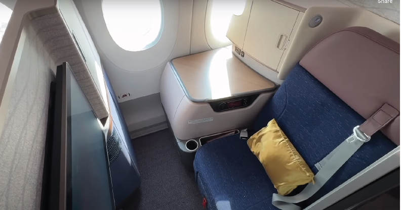
There are two core elements of the visual language, notably the chakra pattern and the window shape. The chakra pattern, akin to 1st-year design school creation, lacks edge. The window, a link to Air India’s heritage, fails to resonate with the contemporary target audience. Overall the absence of a modern touch is glaringly evident.
PROBLEM AREAS
INCONSISTENCIES – a cardinal sin in design
The scale, proportions, and orientation of the vista and pattern fluctuate at every interface, indicative of a lack of thoughtful execution. The fundamental rule of branding is rigid adherence to standards, whereas in this case, the base standard itself is fluid.
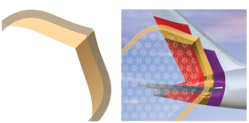
If you create a language it’s important to follow it through in your assets. Unfortunately in the case of Air India, it’s just a thought, not a thought-out design.
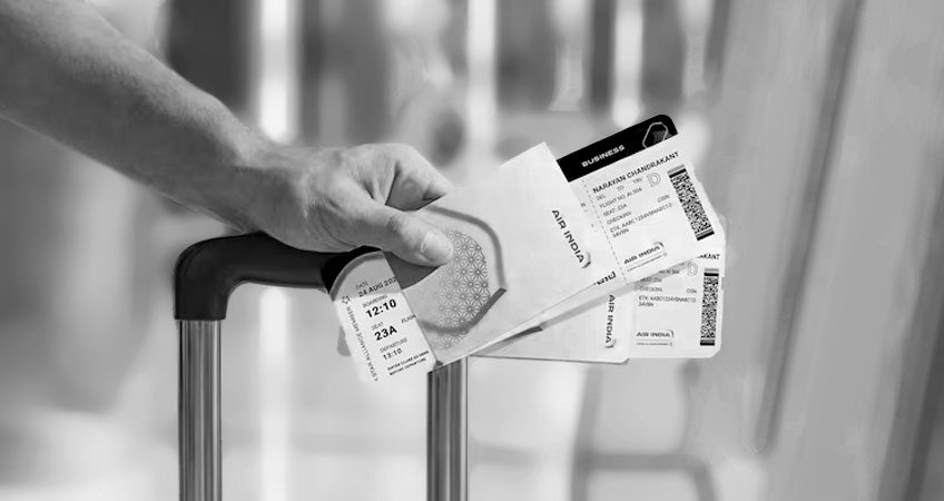
The frame pattern is used only in two places, 1 brand document, and 1st banner image.
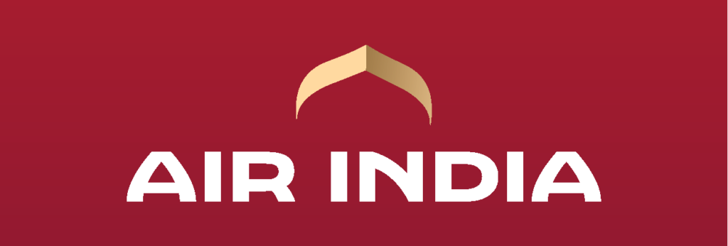
ORIENTATION – this is my biggest peeve
In attempting to salvage an airline drowning in public perception, why opt for a downward-facing airline symbol? You could have done so many other things why this?

This is stronger, more centred, and has a connection with the maharaja as well as the iconic Indian domes. I’m not saying this is great, but it is a much better design solution than the one they currently have
LOST OPPORTUNITIES
Branding extends beyond a mere logo; it entails constructing a compelling experience across all touchpoints. IndiGo serves as a brilliant example, seamlessly integrating ease of use with a robust visual and messaging system. Air India, unfortunately, falls short by a considerable margin, missing the mark on both fronts.
inconsistent font usage
In conclusion, it is my personal opinion that the team failed to adequately educate the decision-makers before spearheading this rebranding initiative. The result is a substantial opportunity lost, leaving Air India’s visual identity lacking in the sophistication and cohesiveness required for a successful rebranding.
Read about the essentials of branding here
Reach out if you want us to audit your existing brand or create your brand story from scratch.
Your friends at Moron Design will be happy to help.